
Explore why neutral colors remain dominant in modern home design and how they influence perception, emotion, and buyer appeal.
Introduction: Neutral Does Not Mean “Boring”
In modern interior design, neutral colors are everywhere.
From luxury apartments to minimalist homes and high-end hospitality spaces, palettes built around beige, white, gray, taupe, and muted earth tones continue to dominate contemporary interiors.
At first glance, this trend may seem repetitive or overly safe. Yet neutral spaces consistently remain associated with:
- Sophistication
- Calmness
- Timelessness
- Premium design
This dominance is not accidental. It reflects deeper psychological, cultural, and architectural shifts in how people experience space.
Neutral interiors succeed not because they demand attention, but because they reduce visual friction.
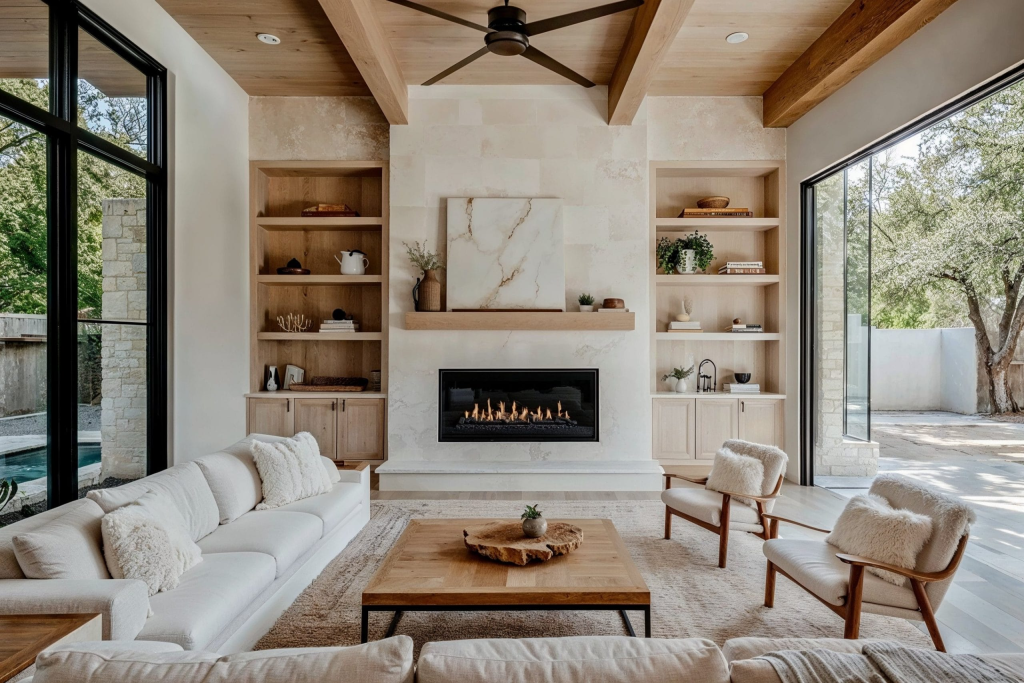
1. Neutral Colors Reduce Cognitive Noise
Human attention is constantly processing visual information.
Highly saturated colors compete aggressively for attention. While this can create energy, it can also create mental fatigue when overused in living environments.
Neutral palettes work differently.
They soften visual intensity by:
- Lowering contrast levels
- Reducing color competition
- Creating smoother transitions between surfaces
This allows the brain to process a space with less effort.
As a result, neutral interiors often feel:
- More relaxing
- More organized
- More emotionally balanced
In modern living environments, where people already experience high digital and sensory stimulation, this calmness becomes increasingly valuable.
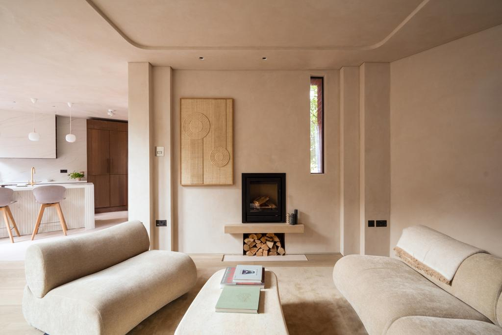
2. Modern Luxury Has Shifted Toward Subtlety
Traditional luxury often emphasized excess:
- Bold ornamentation
- Rich color palettes
- Heavy decorative elements
Contemporary luxury operates differently.
Today, premium spaces increasingly communicate value through:
- Simplicity
- Material quality
- Spatial openness
- Controlled restraint
Neutral palettes support this philosophy because they allow textures, proportions, and lighting to become more noticeable.
Instead of overwhelming the viewer, the space feels intentional and composed.
This is why many modern luxury interiors appear visually quiet rather than visually loud.
3. Neutral Spaces Adapt More Easily to Different Identities
One reason neutral interiors remain commercially effective is flexibility.
Strong color identities can feel highly personal. Neutral environments create broader emotional accessibility.
Buyers and occupants can more easily imagine:
- Their furniture
- Their routines
- Their lifestyle within the space
This psychological openness matters significantly in residential design and real estate presentation.
A home that feels adaptable often feels more livable.
4. Natural Light Interacts Better With Neutral Tones
Neutral palettes respond more dynamically to changing natural light throughout the day.
Unlike highly saturated colors, neutrals:
- Reflect light more softly
- Preserve tonal consistency
- Create smoother shadow gradients
This produces interiors that feel visually stable and atmospheric under different lighting conditions.
As daylight changes, the room feels layered rather than visually chaotic.
This subtle interaction between color and light contributes heavily to the “premium” feeling associated with modern interiors.
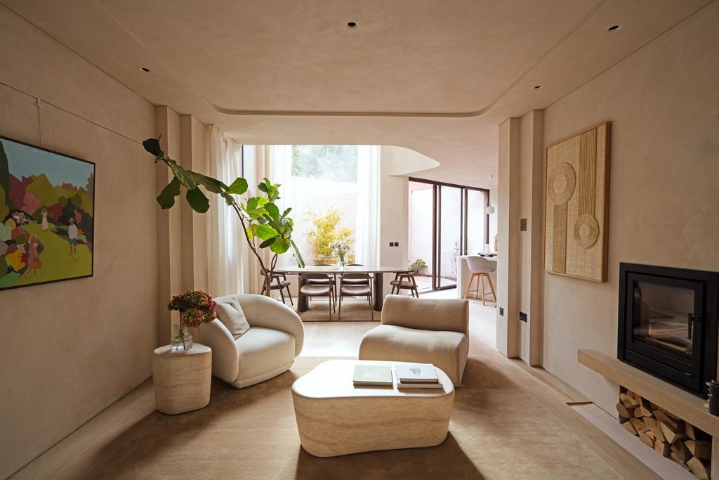
5. Minimalism Influenced Contemporary Color Preferences
The global rise of minimalist design strongly influenced modern color trends.
Minimalism prioritizes:
- Spatial clarity
- Visual breathing room
- Functional simplicity
Neutral colors naturally support these principles because they reduce distraction and emphasize form.
However, modern neutral design is not purely minimalist.
Many contemporary interiors combine neutral foundations with:
- Organic textures
- Warm materials
- Layered tonal variation
This creates warmth without visual overload.
6. Neutral Colors Create Stronger Architectural Focus
In highly colorful interiors, architecture can become secondary to decoration.
Neutral palettes reverse this relationship.
When color becomes quieter:
- Shapes become more visible
- Proportions feel clearer
- Material transitions stand out more
This increases awareness of the architecture itself.
As a result, spaces often feel more refined because attention shifts toward composition rather than decoration.
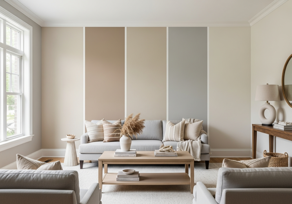
7. Social Media Reinforced the Preference for Neutral Interiors
Digital culture played a major role in accelerating neutral design trends.
Platforms like Instagram, Pinterest, and architectural media consistently favor interiors that:
- Photograph cleanly
- Maintain tonal consistency
- Feel visually calming on screen
Neutral spaces perform well digitally because they reduce visual clutter and create clearer focal points.
Over time, repeated exposure to these aesthetics shaped public perception of what “modern” and “luxury” look like.
8. Neutral Does Not Mean Emotionless
One of the biggest misconceptions about neutral interiors is that they lack personality.
In reality, emotionally effective neutral spaces rely heavily on:
- Texture variation
- Material layering
- Lighting atmosphere
- Spatial balance
The emotional impact comes from subtle sensory relationships rather than strong color contrast.
This is why some neutral interiors feel warm and sophisticated, while others feel cold and sterile.
The difference is rarely the palette alone. It is the composition surrounding it.
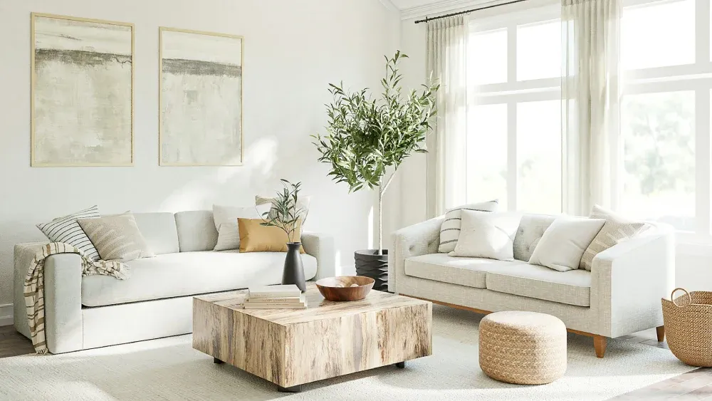
Professional Insight: Neutral Design Reflects a Broader Cultural Shift
The popularity of neutral interiors reflects more than aesthetic preference.
It reflects a cultural movement toward:
- Calmness over stimulation
- Flexibility over excess
- Experience over display
Modern homes increasingly function as spaces for recovery, focus, and emotional comfort.
Neutral palettes support these functions by creating environments that feel less visually demanding.
Conclusion: Neutral Colors Continue to Dominate Because They Shape Experience
Neutral interiors remain dominant not because they are trend-proof, but because they align closely with modern psychological and lifestyle preferences.
They:
- Reduce visual stress
- Enhance light quality
- Increase adaptability
- Support emotional comfort
Most importantly, they allow spaces to feel intentional rather than overwhelming.
In contemporary home design, that sense of balance has become one of the strongest indicators of modern luxury.
Work with Lumatrix Media to Create More Refined Property Presentation
At Lumatrix Media, we focus on how visual atmosphere shapes the perception of space.
From lighting balance to tonal consistency and spatial flow, our editing approach is designed to help properties feel more refined, calm, and visually intentional.
We believe strong real estate presentation is not about exaggeration, it is about creating clarity and emotional connection.
If you want your property content to feel more elevated and visually cohesive, you can explore our portfolio and contact Lumatrix Media to discuss your next project.

- Facebook: Lumatrix Media
- Instagram: lumatrix.media
- Website: lumatrixmedia.com
- Email: lumatrix.media@gmail.com
Our blog
Lastest blog posts
Tool and strategies modern teams need to help their companies grow.
Realtors Should Have a Repeatable Listing Marketing Process
Learn why realtors need a repeatable listing marketing process to save time, maintain quality, reduce [...]
Reducing the Price Does Not Always Solve a Listing Problem
Learn why reducing the price of a home does not always lead to more offers [...]
Why Realtors Need Different Marketing Strategies for Different Price Ranges
Learn why real estate marketing strategies should change across different price ranges, from buyer expectations [...]
Why You Should Shoot More Real Estate Footage When Filming a Property
Learn why filming more real estate footage during a property shoot gives editors more options, [...]
Why Filming for Social Media Is Different From Filming a Property Tour
Learn how filming for social media differs from a traditional property tour, including framing, pacing, [...]
Why Music Choice Can Change How Buyers Perceive a Property
Discover how music choice can influence the way buyers perceive a property, from mood and [...]
Why Small Rooms Need Different Camera Techniques
Learn why small rooms require different camera techniques in real estate photography and video, from [...]
Why Some Real Estate Footage Looks Good but Edits Badly
Learn why some real estate footage looks great on its own but becomes difficult to [...]